
It’s been a while, but it’s time for another round of HDR collaboration. We had originally planned for this to go up on Halloween, but Hurricane Sandy intervened. So if some of the entries tend towards the eerie, that’s why. That we ended up publishing on Election Day as a substitute for Halloween, well, write your own jokes. Playing this round are Jacques Gudé, Mike “TheaterWiz” Criswell, Jimmy Denham, and Rob Hanson.
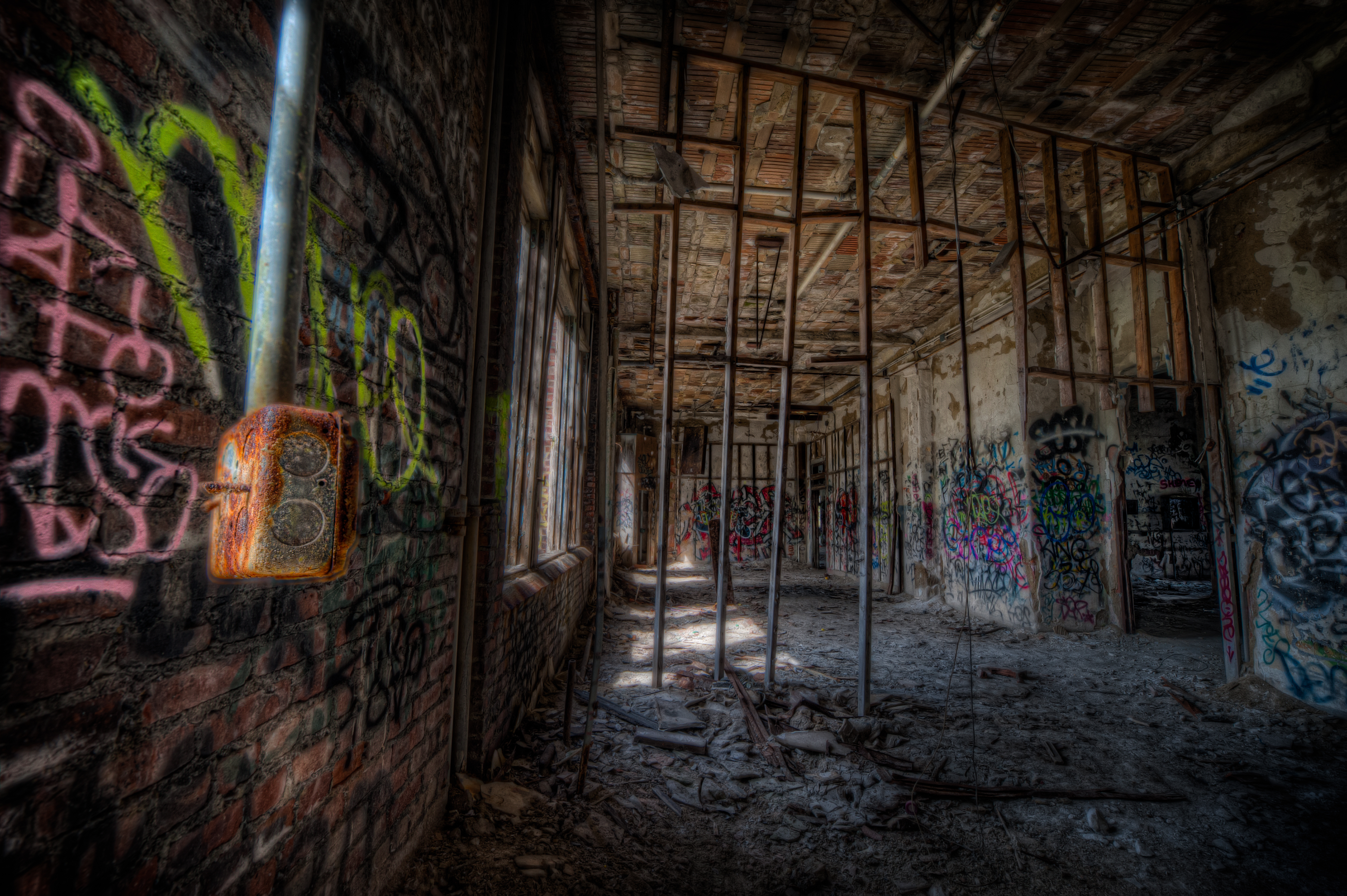
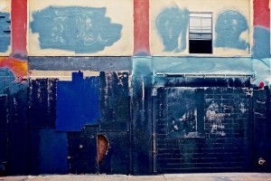
That’s my take on the image above. Before letting the crew show and discuss their own interpretations, I need to explain that everyone had a choice of two sets of photo brackets to work with. They were identical except for one camera setting. One set was shot with a shallow depth of field at an Aperture setting of f/2.8, and the other with broader DOF at Aperture f/11. Each participant chose one set, or in some cases, mixed them together. I personally used the f/2.8 version with shallow depth of field, with tiny bits of the other version mixed in, mostly on windows and doorways.
Finally, you might see some text formatting issues, with the explanations of my collaborators wrapped around their images instead of positioned more clearly below. It probably depends on the size and resolution of your monitor. If I can figure how how to fix that, I will.
Now, on to the other visions:
Jacques Gudé
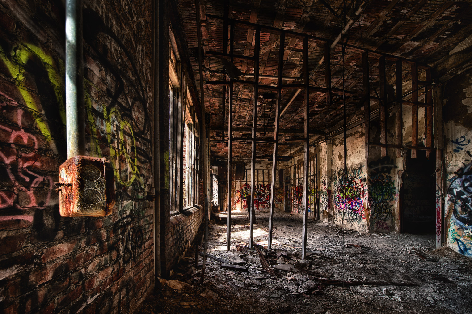
It has been far too long since I’ve had the opportunity to work brackets with you guys, and this is definitely a great set to come in on. You all know I love me some URBEX. As it turns out, I just finished watching the first bangin’ episode of this season of The Walking Dead, so I’ve channeled that while I was processing this. My man Mark (‘sup Dude?) tossed some fab brackets out there for us, as he always does. In fact, he gave us two sets (one with the background in focus, and one with only the foreground in focus). Rather than choose, I opted to process both through Photomatix, toss the finished files into Photoshop, and then mask the crispy bits from each bracket into one prison sandwich. No, not that kind of prison sandwich! Anyway. I used a few of my favorite tools to bring out the details in the shot, then tossed in a little secret sauce to get a bit of an illustrated effect in goin’ (it is, after all, somewhat inspired by the “Graphic Novel” (we called ’em comics when I was a kid) based The Walking Dead). I then darkened some areas, while shining a bit of light on others. Added a little selective color saturation and that about did it. Again, thanks Mark for some great brackets to bash about, and [belated – ed.] Happy Halloween to all of you!!!
Mike Criswell
Thanks for the great gritty Urbex Brackets Mark, I always enjoy someone else’s grunge! Great Stuff. I liked both versions, and in the end used both. I was really unsure of the processing on this one, so many details to catch the eye’s. I went with a simple approach and enjoyed every bit of it, nice stuff and great to have the collab back in the saddle. A shout out to Jacques as well, welcome back!
As for the processing, I am still stuck with Photomatix, a little NIK and OnOne, thanks again Mark.
Rob Hanson
Scenes like this are fantastic! They have so much detail, so many possible areas on which to concentrate. When you have really good ‘mess’, the eyes dance around the scene, and it’s a pleasure to go to work on it.
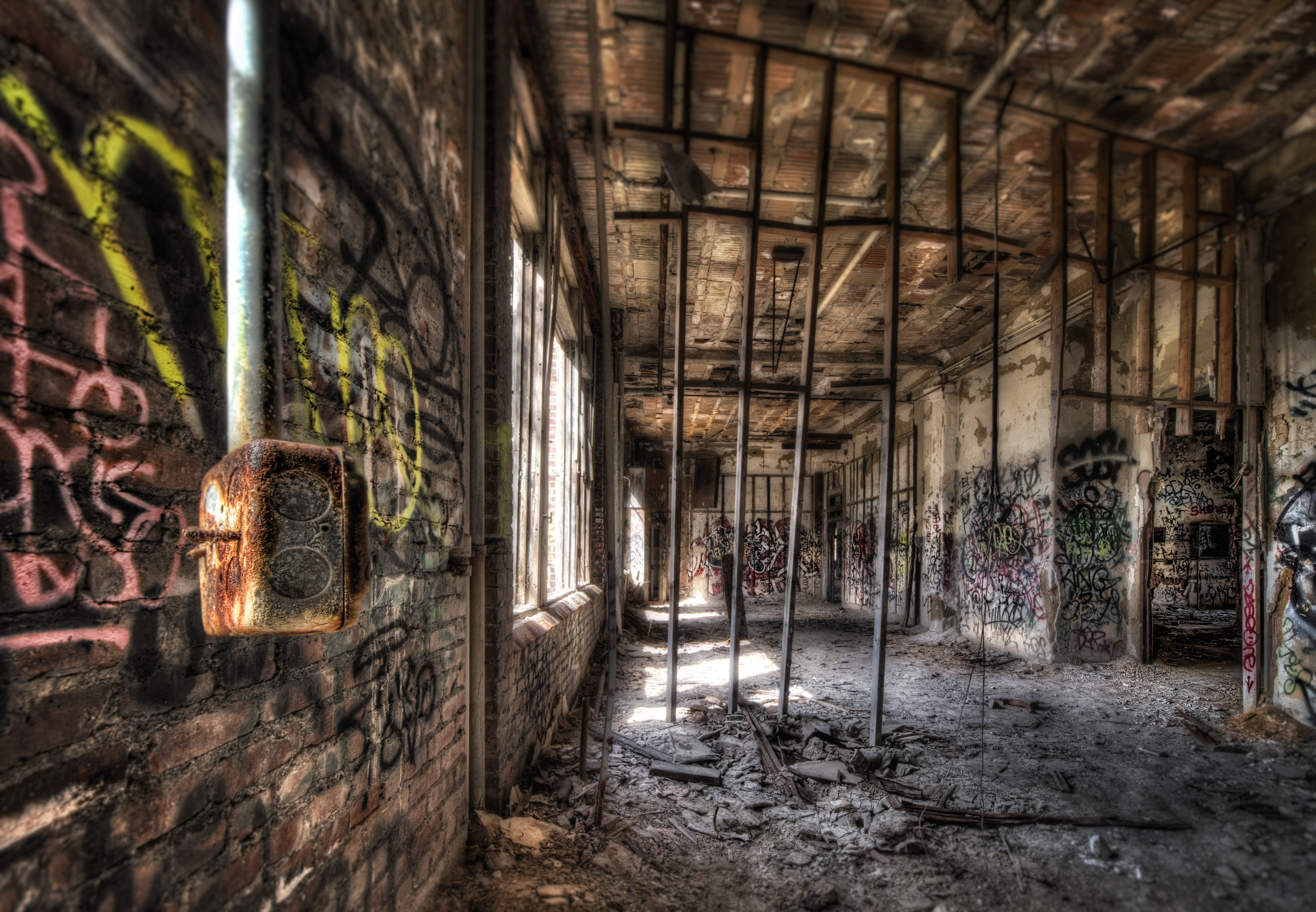
We were given two versions to work with for this round. Why not work with both? As a base, the two sets were combined into one image in order to pull up the details. Several different directions were taken until the lighting seemed just about right — natural, yet illuminating the details of the switch box, the graffiti, the floor, and that gorgeous ceiling. I figured a good bit of straightening was in order, but there was nothing that could be done with those studs in the center… they’re too far gone.
Thanks
Jim Denham
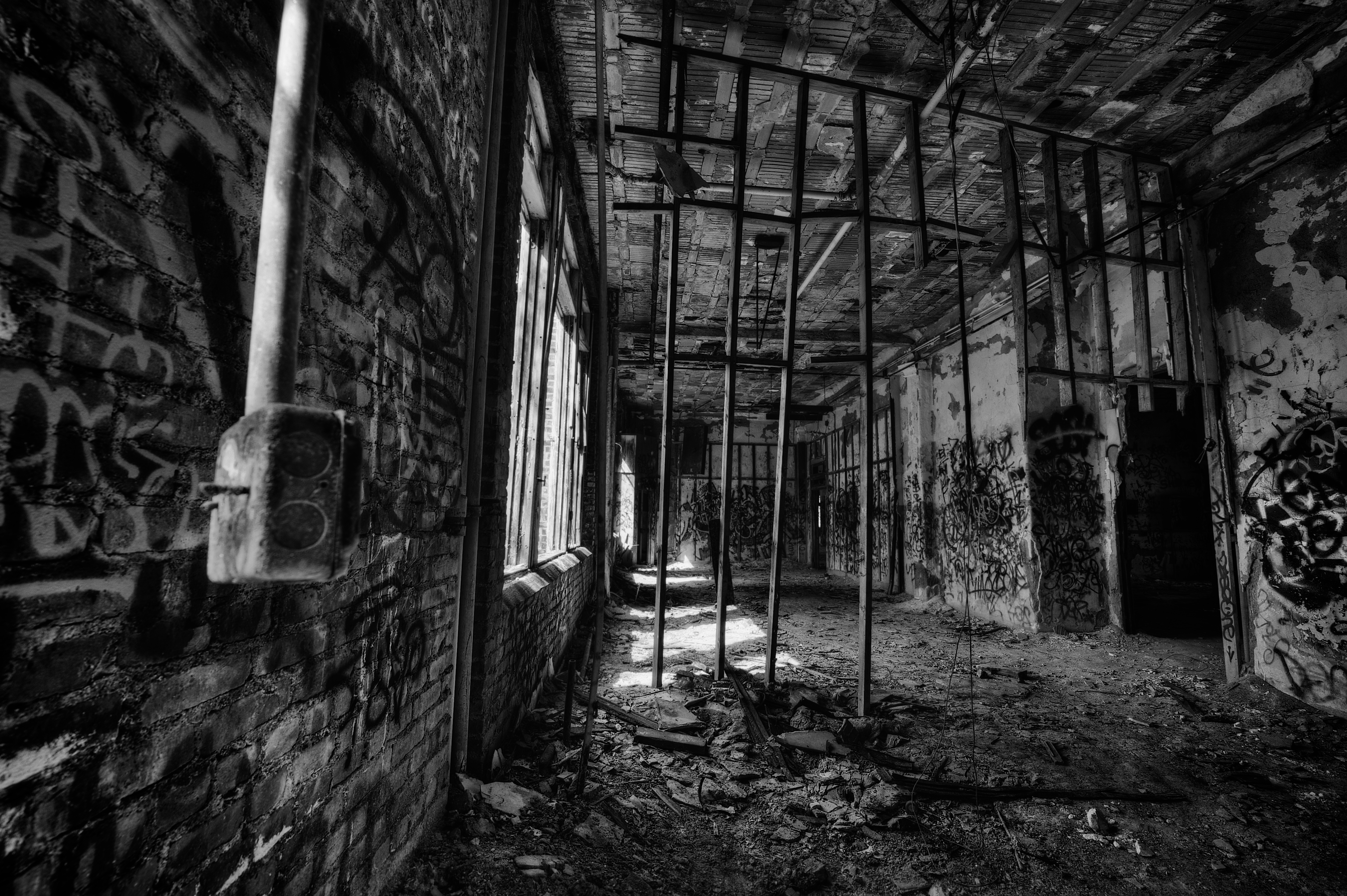
Great sets of brackets Mark – loved the grit, texture and decay! I struggled a bit to come up with a plan for processing, though. The suspended socket was the most obvious focal point, but focusing on it pretty much meant secluding the rest of the frame, at least to a point. So, instead, I decided to go black and white and apply a Kodak Tri-X preset to the tone mapped image in Aperture, then up the contrast to better accent the textures. The intent was a vintage-like B&W and I liked the finished product!
Once again, thanks Mark for another great set of brackets – really enjoyed them!
Jacques
6 Nov 2012Great show, all!! Fab renderings from everyone, as usual. Really great to be in the mix; Ive really missed the collaborations. Missed you guys!
Edith Levy
6 Nov 2012You guys are awesome. What a cool set of brackets to work on. Phenomenal job gentlemen.
Jim Denham
6 Nov 2012Well done fellas! Thanks for sharing and hosting Mark!
Dave Wilson
6 Nov 2012Nice job, gents, and it’s especially good to hear from Jacques – I’ve been missing you, sir!
Robert Lussier
6 Nov 2012Agree with Dave. Great work, all. Sorry to miss this round. And… Hi Jacques!
Erik Kerstenbeck
6 Nov 2012Nice work fellas.
Jacques Gudé
6 Nov 2012Great show, all! Fab renderings from everyone, as usual. Really great to be in the mix; Ive really missed the collaborations. Missed you guys!
Mark Neal
7 Nov 2012Interesting interpretations. I like the variety.
Mike Criswell
10 Nov 2012Sorry I am late on this, great work everyone!