2020 UPDATE: I recently shared a revised edit of this image, which I much prefer to this version. Please take a look.
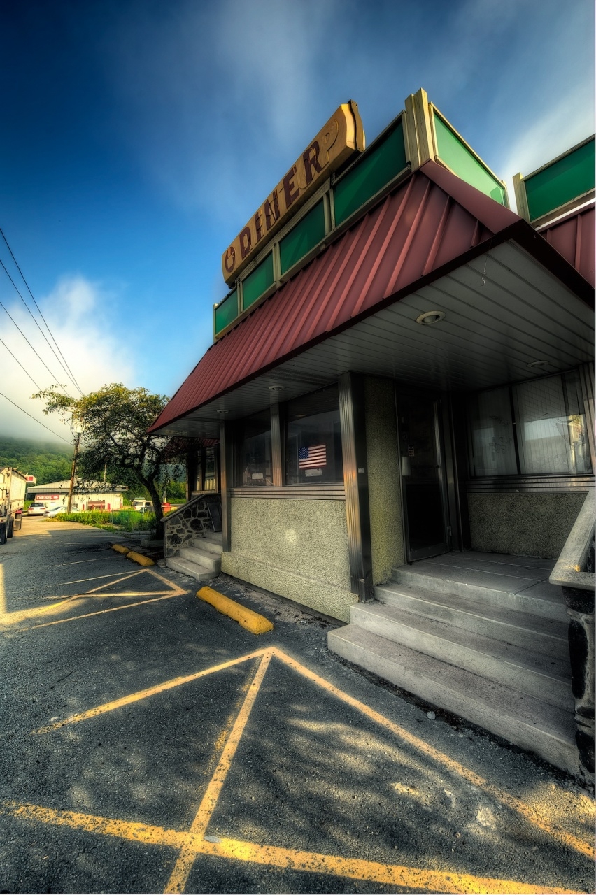
I previously showed a black and white fake infrared of this diner last July, way back when I took these images. I had real trouble deciding how to process the images of the diner, as the colors are a bit garish and hard to get a handle on. That’s why I ended up with black and white last time. For this image, I punched up the saturation of the environment, but brushed it back out of the diner itself, which seems to create a nice contrast.
I only noticed something this week, when I looked at a high magnification to set the sharpness, that the “Diner” sign is painted over raised letters that said “REST STOP.” You can actually see it pretty clearly, but I just never noticed.


Chris Nitz
14 Apr 2011I like how this goes from light colors on top to dark tones on the bottom. I also really enjoy how much those parking lines jump off the screen. Very nice!
Chris Nitz recently posted..Cloud Surfing
Viveca Koh
14 Apr 2011That’s so vivid and three-dimensional I feel I could almost be there! Great shot, I like the rest stop/diner detail, it’s a nice touch.
Wayne Frost
14 Apr 2011Very nice post processing work, Mark.
Wayne Frost recently posted..Bowl of Blooms
Jason Hines
14 Apr 2011Awesome Mark! I love that you kept some of the blacks around the door and window. I also like the saturation of the yellow lines.
Jason Hines recently posted..Lines
Chris Kenison
14 Apr 2011Love this shot, Mark!
Toad Hollow Photography
14 Apr 2011I love it Mark, great image. Really wonderful composition here, and there is a lot of little things for the viewer to take in. Great job, my friend!
Toad Hollow Photography recently posted..Architecture
Barbara Youngleson
14 Apr 2011Great perspective; glad that you chose a vertical orientation. Love how you lead our eye “up” to that fabulous sign.
Barbara Youngleson recently posted..Two Chimneys
Pingback: Route 17 Diner Signs - Too Much Glass » Too Much Glass