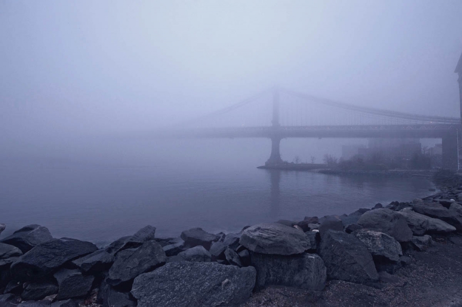
I don’t remember it being quite this blue. Everything was more of a murky, desaturated grey. Unfortunately every attempt to color correct this image looked even more wrong. I tried various methods, and everything ended up making it warmer, which seemed no better.
Hmm. The very act of writing this up gave me an idea. Maybe you’ll see this image again, just different.
Also, the painterly effect is nothing more than the fog. It’s not something I enhanced in processing.

Cab
16 Jan 2013Nice, Mark. I love rock walls, and I love fog, so well done, IMO! I know what you mean about weird colors. The natural colors of winter seem to be hard to duplicate in pixels.
Cab recently posted..15 Jan 13 – Snowy Dock
Mark Summerfield
16 Jan 2013This is a nice composition so I would persevere with the post processing. How about creating a B&W version of the shot or maybe a B&W layer in Photoshop with the opacity pulled back a bit so that some of the blue toning shows through from the original version?
Mark Summerfield recently posted..Overhead Door
Mark Neal
16 Jan 2013I like it as is, Mark. Did you try dropping saturation of cyan and magenta? Just a thought.
LensScaper
17 Jan 2013I’ve found this type of weather (Min my case mist over mountains) notoriously difficult in colour. Usually I give up and convert to B&W – it’s the lazy way out, but I don’t think the colour actually contributes to the image and B&W has a timeless quality to it.
LensScaper recently posted..The Theodul Pass Zermatt