
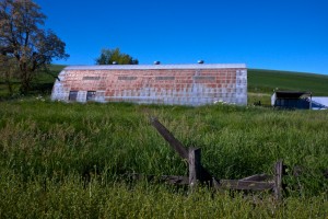
When my older daughter was about 2-3 years old, I sometimes played a restaurant game with her. She had her toy dishes and kitchen utensils, would ask me what I wanted to eat and she would prepare it by slaping a spatula on a plate. Then I would eat it and express my amazement at the quality. One day while playing I asked her what the name of her restaurant was. She thought for a moment, then answered “The Good Food Restaurant.” I am always reminded of that whenever I look at Heid’s of Liverpool and its slogan “Food You’ll Like.” It’s refreshingly simple and direct. Heid’s is a Central New York landmark closing in on it’s 100th anniversary in 2017. Franks and coneys are its staples.
I am not particularly given to use of the Topaz Plugins Clean or Simplify, but I do rely on them occasionally. They both have the capability of making an image look quite painted, sometimes by softening all details and colors, or by going in the other direction and adding detail that mimics a water color or brush strokes. Wayne Frost is one photographer who has taken to this look and you can get a sense of how he works with it here and here. I used the BuzSim preset in the Simplify plugin for this image. The building’s clean lines and circles seems to complement the flat look. Meanwhile, the plugin seemed to tame the large number of wires, poles, and the metal canopy structure on the right. I selectively brushed back some of the building detail and played with the color tones using other tools.
By the way, this is another shot taken while my wife drove on Thanksgiving Day. This is in Liverpool, a Syracuse suburb, just off Onondaga Lake. I need to get back and shoot the place at night with the lights on, preferably in warmer weather when the canopy is covered with a nice red and white fabric that plays nicely off the building colors.
Jimi Jones
9 Dec 2011Nicely done, Mark. I like the result of this processing. I enjoyed the back-story about your daughter as well. :-)Nice to have those fond memories to look back upon.
Mark
9 Dec 2011This is one of those days when I wish I had in-line Comment Replies on my blog, because I have something to say to everyone. Thanks for the comment Jimi, and glad you enjoyed the small anecdote.
bob emmerich
9 Dec 2011Crazy color mark. Simplify is a great tool for enhancing color and smoothing out an image.
Mark
9 Dec 2011Hi Bob,
Your comment suffered from one of those bizarre web formatting and typesetting accidents, so I cleaned it up. Thanks for the remarks, however garbled they first looked once the software had its seemingly drunken way. 😉
Wayne Frost
9 Dec 2011Thanks for the shout out, Mark. One quality of our children that is a great influence on us, is their ability to imagine. You picked a perfect subject to apply this treatment to, the building seems to be a homage to Streamline Moderne architecture, which is one of the ideals I look for when I am scouting for subjects for my painterly treatment. As a subject Heid’s is a great example of a piece of Americana captured and preserved.
Wayne Frost recently posted..Egress
Mark
9 Dec 2011Wayne
I agree the photo style of the Topaz plugins works well with Streamline Moderne. I’m not sure whether this building is an unusually early example of the style or whether this is not the original building. As I mentioned in the post, the restaurant dates to 1917, and Streamline Moderne didn’t really develop until the 1930s, as far as I know. So this building could be an homage, example, or precursor of the style. My research has not been able to discern.
Mark
James Howe
9 Dec 2011I think Topaz Simplify can do some wonderful things for certain types of images. I’ve used it for architecture and automobiles at various strengths (mostly using BuzSim). I like the way your shot came out with the Topaz processing. As Wayne said, the building certainly has some Streamline Moderne qualities and I agree with Wayne that the Simplify treatment works well with this type of architecture.
James Howe
9 Dec 2011One more thing, here’s a tip with using BuzSim that I sometimes find useful. When using BuzSim on things with letters or things with lots of lines (like wires), sometimes the filter will fill in the item and creates a blockier look, generally in purple-ish tones. When I see these, I’ll often times use a layer mask and reduce the opacity to reduce or eliminate the look. In your shot, if you look at the lettering on the side of the building ‘Food You’ll Like’, you’ll notice the o’s and the d are filled in with a purpleish/blueish color. It’s those sorts of things that using a layer mask can get rid of if you don’t like the look. Note that this isn’t meant as a criticism, just a tip.
Mark
9 Dec 2011Hi James. Thanks for both comments, including the tip. I hadn’t noticed that tendency of BuzSim — probably because I haven’t used it as much as Wayne and you have. I did notice it here, and chose to leave it because I otherwise liked what it did to that set of lettering. In contrast, the lettering in the HEID”S sign on top of the building is completely taken from the non-BuzSim version, because the plugin made it way too blocky and indistinct. I suppose I could have tried masking out just the blue/purple fill-in, but I thought it would never come out clean enough. Or course, I didn’t even try (I admit) sI might have been wrong. In effect, I thought it was worth keeping although I didn’t love it.
Toad Hollow Photography
9 Dec 2011Fabulous shot, Mark, love the colors and tones here. These old diners are incredible.
Toad Hollow Photography recently posted..Holiday Court Motel