I started commuting into New York City when I was 14 years old, and even though I’ve never lived in the Bronx, the words “Uptown & the Bronx” will always signify going home to me.
I was fortunate to be accepted into an all-scholarship Jesuit high school on the Upper East Side of Manhattan called Regis. I lived in Yonkers, which is a city bordering the Bronx. We lived so close to the Bronx city line, in fact, that it was easier to take the subway and a connecting bus instead of riding the Metro North suburban commuter railroad to and from Grand Central Station. I attended high school in the late 1970s: Billy Martin was manager of the Yankees (about 17 different times), the Bronx was burning, Studio 54 was sizzling, Son of Sam was loose, and on the subway I kept my head down, probably studying Latin or reading Tolkien. Every afternoon as I descended into the subway at 86th Street to take the Number 4 Train to its last stop at Woodlawn Cemetery, the words “Uptown & the Bronx” meant heading home.
After high school, I spent seven years at university on Morningside Heights on the Upper West Side (don’t snicker at the length of time, I got 2 degrees). Although I did not commute, I did go home for a day visit most Sundays, and took the No. 1 train to its terminal at Van Cortland Park. Again, “Uptown & the Bronx” meant going home.
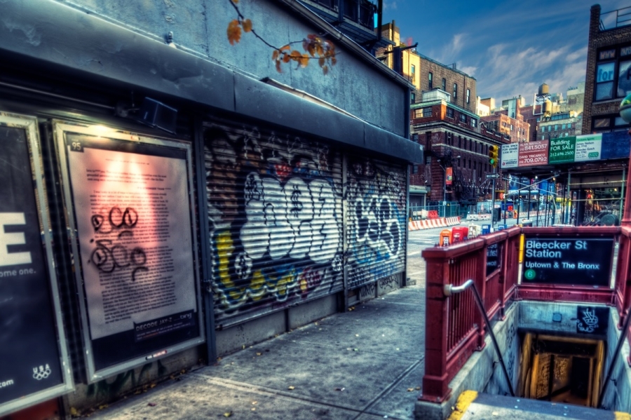
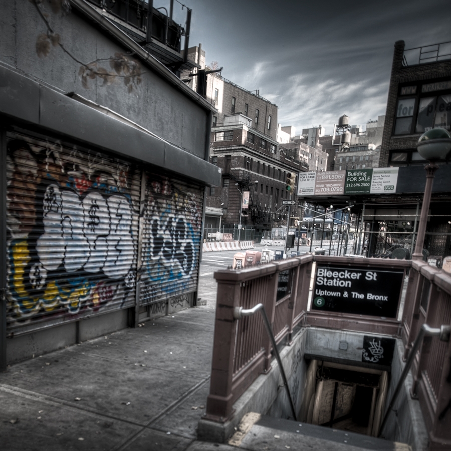
So even though I now live in Queens, and no matter what other elements are present, when I look at this image, I cannot but help thinking that down those steps lies the way home.
It was those memories that inspired me to share this image with my friends for this HDR swapping exercise. Apart from the different visual interpretations that everybody created, I found it fascinating to read each participant’s explanation of his inspiration and what he imagined or understood the scene to represent and how it differed from mine. Of course I did not tell any of them about what the image evoked for me, and none of them has had any idea until I published this post. For my interpretation, I tried to keep things simple. I used a cross-processed film look from the Nik Color Efex suite, which creates a bit of a vintage if somewhat artsy feel. I did not apply that filter to the sky, however, as it ended up looking a bit too unnatural. As you’ll see, other went in a completely different direction and imagined very different scenarios from what this image did for me.
By the way, this is going to be my last entry as a regular participant in this club. There is no juicy back story. As much as I have enjoyed it I found that some of the extra effort was wearing on me and I decided to give myself a break. I might do some guest spots on occasion, and who knows — maybe I could rejoin some months down the road if things break that way. Either way everyone involved has my best wishes for the continued success of the project. I especially want to welcome Mike Criswell into the group as he will be filling in my old spot. The next entry in the series is going to be at Jacques Gudé’s site and is tentatively set to drop next Monday, on Valentine’s Day (but I wouldn’t expect chocolates and roses). Finally, Brian Matiash was too busy to play this week, but is staying in the group.
One additional note: if you subscribe to my RSS feed you might have received a draft version of this post yesterday when I inadvertently published it. If you were wondering why it wasn’t finished, and also why you could not access the actual post on my site, that is why.
With that lengthy introduction, everybody’s entry can be viewed by clicking the “View Full Post” link if you are on the main site page, or just scrolling down if you are already on the specific page for this entry.

Bleecker Street Station
Bleecker Street Station
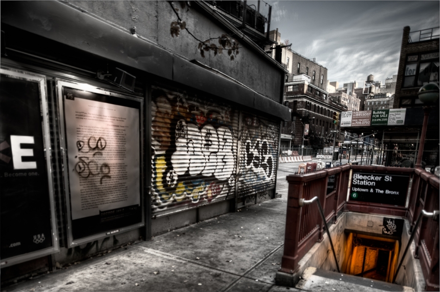
I really dig the Bleecker St set of brackets Mark gave us to work with, as it reminded me a bit of those End of Days, Resident Evil (the street level scenes, obviously) and Zombieland (very cool zombie flick) type flicks. I imagined myself running (Rule #1 – Cardio) around the streets double-tapping (Rule #4 0 The Double Tap) trying to find a safe haven from the living dead. In this scene, I desaturated the image quite a bit to really focus the attention on the entrance into the Beecker St Station, which I saw as the only escape route from the street level carnage. I also chose to brighten and increase the warm light levels coming from the underground.
Bleecker Street
This bracket set brought back memories from over 20 years ago. I used to commute to New York City often for work. Being a nature-lover, my experience of the city was rarely in line with my preferences, and I always looked forward to crossing the river and returning home.
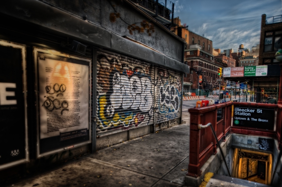
In this image, I can easily imagine myself coming up from the bowels of the subway system, shuddering at the darkness and the grit and grime, looking toward the sunshine on the buildings, which points the way to my escape. At this time of day, that way is west, and that’s where the river is. Go. Before it gets dark.
With this in mind, I tried to emphasize the dinginess of the foreground elements, and I lit the subway stairway as though it leads to the underworld (which it does), while brightening the distant buildings and the street that leads to them. Details on either side of the escape route were diminished in an effort to lead the eye down the street toward the sunlit buildings.
Okay. So I’m not a city boy. 🙂
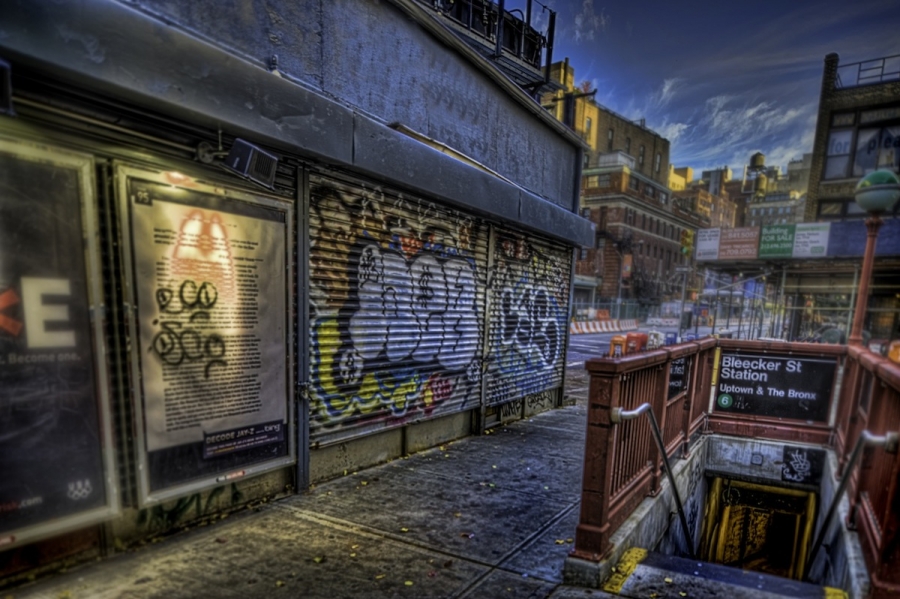
In processing this, I pulled back on the saturation more than I usually do, then masked back in the graffiti to make it pop a bit. I thought I was finished processing, but something was bothering me about it. My eye didn’t know whether it wanted to go into the subway, or out onto the street. I decided that was a good thing. In order to accentuate that decision point, I went with a square crop. By eliminating the left portion of the image, I hope to push the viewer into exploring the scene the way I did when I first processed the image.
Thanks for these brackets, Mark. As a Red Sox fan, I don’t REALLY want to ever think about going to New York. But then I see images from the city and I realize what a cool place to shoot it is.
NB: The works that are not my own are NOT subject to my Creative Commons license and cannot be used without permission.
Oscar Navarro
10 Feb 2011Congrats to the team, love all of them!!
Oscar Navarro recently posted..Come in and be blessed
Pingback: Tweets that mention Uptown & the Bronx - An HDR Collaboration - Too Much Glass » Too Much Glass -- Topsy.com
Jim Denham
10 Feb 2011Thanks for sharing the brackets and the story behind it! Great stuff and a lot of fun to work on! Hope to work more with you in the future!
Jim Denham recently posted..100
Rob Hanson
10 Feb 2011Thanks for hosting the brackets, Mark! We’ll miss your contributions, and hope to have you back some day when it works for you. It’s always a pleasure to work with you.
Rob Hanson recently posted..Landscapes
Jerry Denham
10 Feb 2011All are incredible! Mark those brackets are insane with options and color. Great job all!
Jesse Pafundi
10 Feb 2011Another great collab guys. Really enjoyed the post. Jacques, that was a very cool direction to take this image.
Jesse Pafundi recently posted..School’s Out – Grunge Collaboration
Hector Garza
10 Feb 2011Congratulations to the HDR boys.
I love them all… I have my fav, but I won’t tell which one it is 😉
Wayne Frost
10 Feb 2011I really like Jacques’ rendition, it really emphasizes the grittiness of city living, I can almost smell the aroma of the city as I imagine myself coming up those steps.
Wayne Frost recently posted..Never Let A Threat Of Rain…
Tobias George
10 Feb 2011Great collaboration, guys! All these images are fantastic. Love the history, and what the image means to you Mark… a true New Yorker!
Tobias George recently posted..All Aboard!
Mike Criswell
10 Feb 2011Sweet work everyone, I cannot wait to join in the activities
Chris Kenison
10 Feb 2011Great work everyone! I’m really diggin the desaturated images! Great bracket, Mark
Chris Kenison recently posted..Stepping Stool to a Sunset
Timo
11 Feb 2011That’s really awesome!
Thanks a lot for sharing this interesting background info about you!
Timo recently posted..Carcassonne 2
Pingback: Mama, I’m comin’ home… » Exposed by the Light
Pingback: Grade Crossing - Another HDR Collaboration - Too Much Glass » Too Much Glass
Pingback: Blackwell Lighthouse - An HDR Collaboration - Too Much Glass » Too Much Glass